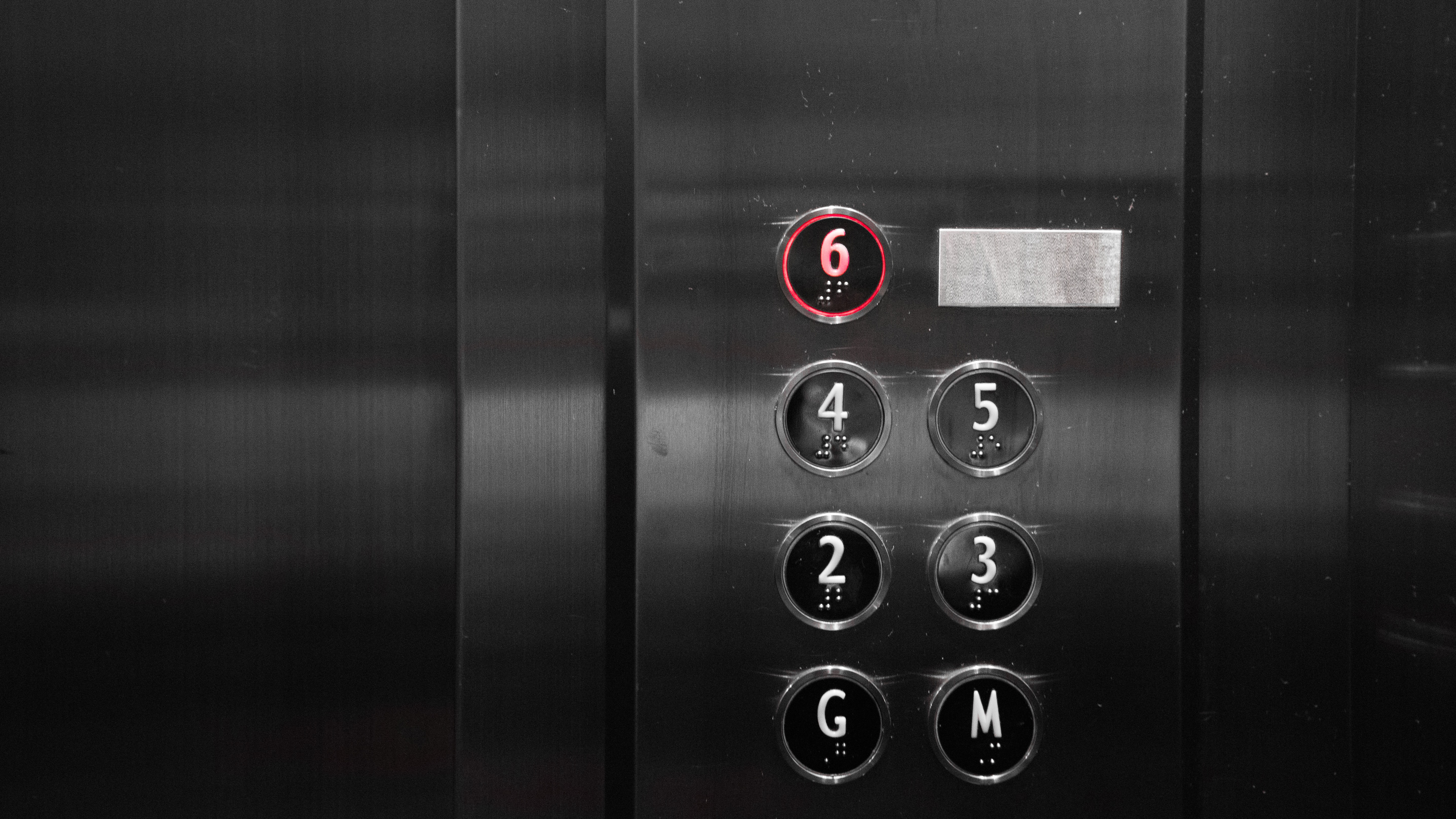
The most obvious sensors in my daily commute come in the form of buttons. Partially because of their long history and recognizable look, more often than not being circular and protruding, but also because they’re designed to be pressed and therefore seen. A button that you gloss over without recognizing is usually the result of bad design. I come across them outside at crosswalks, inside at elevators, doubly inside inside the touch screens to order food. There are buttons to open doors for most buildings, buttons for me to input information when I’m paying for things with card.

In regards to buttons, most have some kind of visual interface in attached screens or LEDs built around or near them to give user feedback to notify them that the button has been pressed / is doing something. Some buttons like the crosswalk buttons often play audio queues for the vision impaired to hear. I don’t think I can really think of a button that I’ve mentioned that doesn’t actively give feedback and acknowledge that it’s been pressed. The only somewhat grey circumstance is with touchscreens, when out of battery or dirty, or malfunctioning they’re totally unresponsive. The lack of separate dedicated interfaces for showing feedback means that there are sometimes moments where you’re not entirely sure which of the issues is responsible for the lack of response.

Buttons in general usually correlate to the smallest input available for each interaction, a singular character, a boolean response, each input being a small part that builds together to contain a lot of data.
